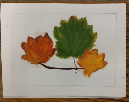
 This is my second water color painting of leaves. I learned to start with warm and light transparent colors to create layers and value. I did my best to use the colors that were in the photograph to make my painting more realistic. my painting is very balanced and simple.
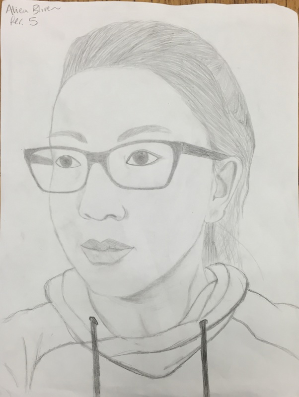
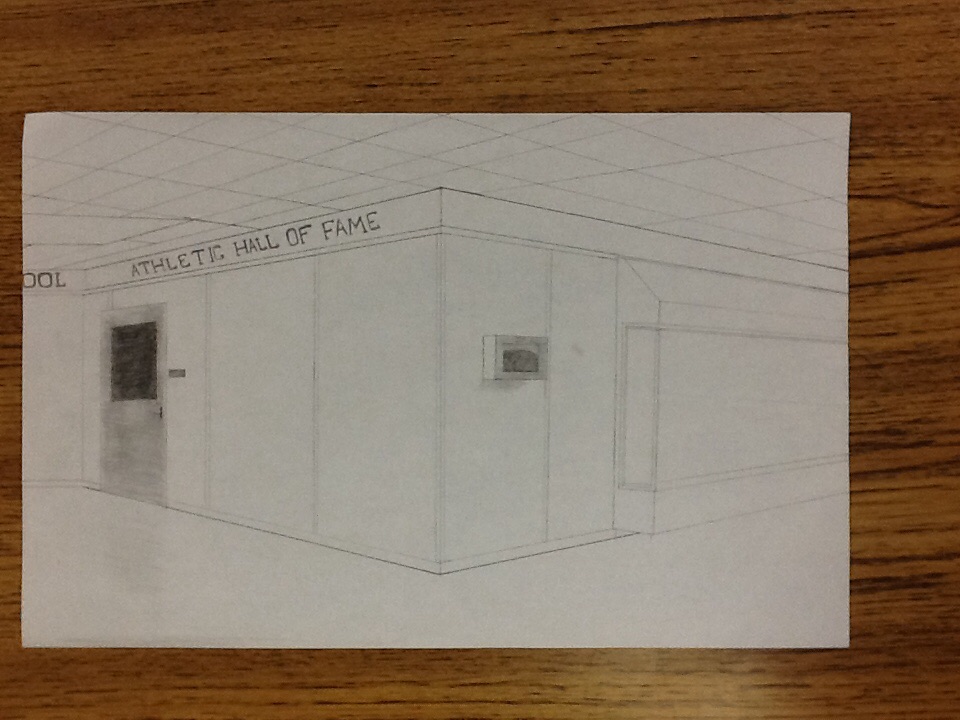
This is my website logo I created using the sketchbook app. I used a dark background and bright text to make my name stand out. I also used a neutral grey to draw the attention to my logo. I also used different colors so that is wasn't plain. I used simple shapes and text so that it wouldn't be too all over the place.  This is my two point perspective drawing of boxes created with pencil. I used dark lines on certain shapes and overlapping boxes to make them stand out. I also used shading to make boxes stand out and not look plain. My drawing looks very structured and bold. 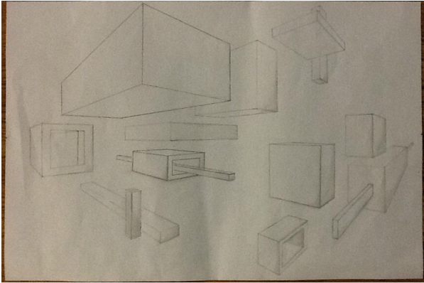 |
AuthorWrite something about yourself. No need to be fancy, just an overview. Archives
January 2016
Categories |
 RSS Feed
